
HOW DO YOU DESIGN FOR ONLINE LOTTERY & GAMING?
Ontario Lottery & Gaming | Design | UX
The Government of Ontario in Canada wanted to develop online lottery and gambling/gaming. Should the online and offline experience be similar or different? How would you balance gaming with being responsible, while still making it profitable for the government?
I architected and designed the entire lottery and gaming site for Ontario Lottery and Gaming (OLG). I collaborated with multiple international vendors (SEO, web analytics, development, marketing) to ensure the site complied to WCAG 2.0 accessibility standards and was launched within the timeframe set by Minister of Finance.
STRATEGY
Business analysis, goals alignment, target user identification, scope definition
I led multiple collaborative sessions to envision an engaging way to buy lottery and play games online. The 12-person sessions included stakeholders from various internal client groups and six external, international vendors


Strategy RESULTS
The six international vendors aligned on business objectives and target user goals. We agreed on scope and deliverables.
Design
User journeys, information architecture, interaction design, accessibility design, usability testing, prototyping
I defined the user tasks that would be needed to meet the project objectives:
1) View public and “logged-in only” sections
2) Log in and register to play
3) Buy lottery tickets
4) Play online games, e.g. slots, poker, blackjack
5) Deposit and withdraw winnings
6) View account to see saved tickets, load money, and account balance
7) Assess gambling behavior and addiction
I then mapped the user journeys that would allow a user to successfully accomplish those tasks. In this example below, the user journeys helped guide the discussion on how the public and "logged-in only" sections of the site can be designed.


I then sketched out what the user journeys would look like if the user was actually on the site. This helped to prioritize information and page hierarchy. It also allowed me to quickly review with the client.

I now had a good sense of the main pages and user actions on the site. I then designed the information architecture and identified the key page templates.

Finally, I created over 100 annotated, accessibility compliant wireframes (WCAG 2.0 Level AA) for every interaction and page on the site.
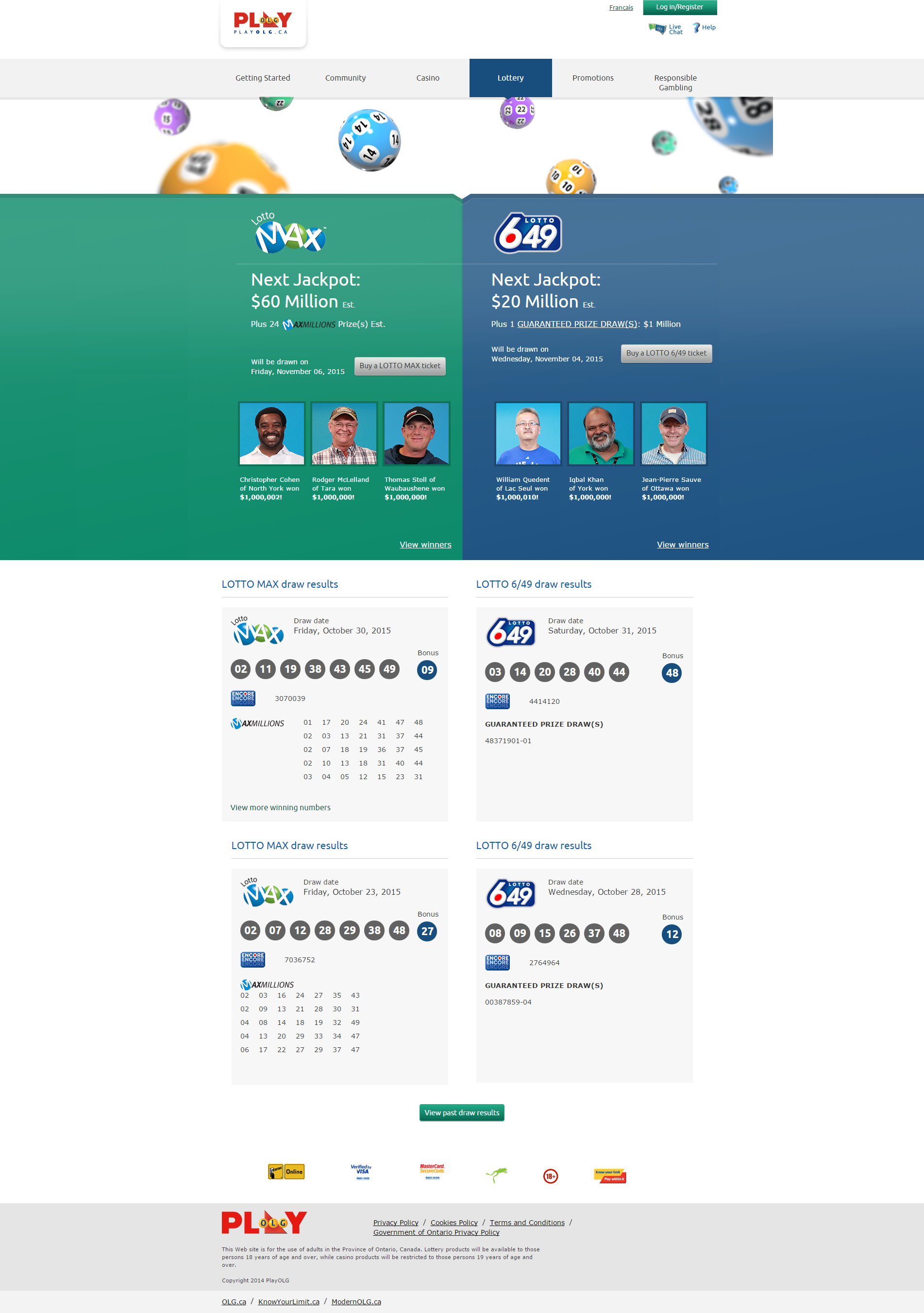
My favorite part was to design the lottery purchase. In the offline, paper selection, numbers are presented in four vertical groups. But in usability testing, users had trouble locating numbers when the offline grouping was presented digitally. So I decided not to mimic the paper version and purposefully designed a different layout to select lottery numbers, in horizontal groups of 10.
Lastly, because users can select lottery numbers and other optional special play numbers, I designed the lottery purchase as an e-commerce buy flow so that it would feel familiar and users can pick and choose what numbers they want to select.
I then collaborated with the graphics design and development vendors to complete the project. During the project, the different vendors were not allowed to speak to each other. Requirements were lost in translation and the project was delayed. I successfully convinced the client to allow us to collaborate. I became the liaison across vendors and successfully included UX in their agile development schedule.

design RESULTS
I designed the first lottery and gaming website for the Province of Ontario in Canada. I architected and designed every interaction on the site, and it meets the WCAG 2.0 Level AA accessibility standard.
I successfully convinced the client to allow all vendors to collaborate and incorporated UX within the development vendor's agile schedule.
The site successfully launched within the timeframe set by the Minister of Finance.